Hello!
It was raining all day today and I felt sad not being able to get out and feel the sunshine. I was even more sad because I suck at designing stuff on photoshop. I am in disparate need of new business cards, as my current ones are running out pretty soon.
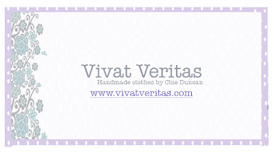
I used a ready-made template before, but I wanted to personalize it a bit more this time. So I’m trying to come up with new design, but none of them seem good enough to print. What do you think?
The reason why I used purple floral and polkadot is that I wanted to be consistent with my website design that Naoko designed for me. Any input is appreciated!
1.


 turquoise blue
Samantha Nandez says
I really like #4, but if you move the VV logo away from the floral print that would be better so you can see it more.
I actually work in graphics design, if you'd like some extra help send me an e-mail:
samanthanandez@gmail.com
NGLaLALa says
Ooo… I really like #2. Those are all really cute!
CatFish says
Also like #2 but it needs your e-mail address on.
Charlie says
Hey Chie,
Before you go any further, you need to get your designer to help you with a logo. You'll spend time and money messing around with tweaks to everything–cards, ads, website–unless you have a good basic image design. Try, try if you can to get some help with a logo and overall graphic design. This will make everything else easier. It will lock in your font, colors, spacing. It should give you a style guide that will then help you with everything else. If I could do it, I would for free. I can't, so try to find someone who will. You're so loveable, who could resist? I'll send you our style guide as an example. It's what led to our really strong image at http://www.NoonmarkAntiques.com.
Kaitlyn Dreyling says
I LOVE #2!
Galatina says
It's such a difficult decision. I really like 2&3 – moving towards number 3 because I like the openness of it. However, generally I think your first instinct is the best. Good luck.
vivatveritas says
thank you all for your input! i ended up ordering #4 for 100 temporarily.
cutandsew says
Where are you getting these cards made? I am thinking about getting some of my own.